Discover the story behind the Facsimile Finder logo and how our cute little owl has changed over the last five years.
 A Midsummer Night’s Dream
During a warm midsummer afternoon, among the serene beaches of the Adriatic Sea, Giovanni started to jot down first ideas for our new company in a notebook we still treasure.
It was an embryonic project, born from that first brainstorming.
While we were planning our new endeavor, a novel idea suddenly struck us,
we said, almost simultaneously, both convinced that only a little owl could represent what we wanted our company to be.
This was how a our cute mascot became central to the foundation of Facsimile Finder.
Thanks to her help and inspiration, our dream has now become a reality.
A Little Owl, Your Guide and Advisor
The equation between the little owl and wisdom comes from Ancient Greece: in every image of Athena, Goddess of wisdom, she is always accompanied by a wise owl.
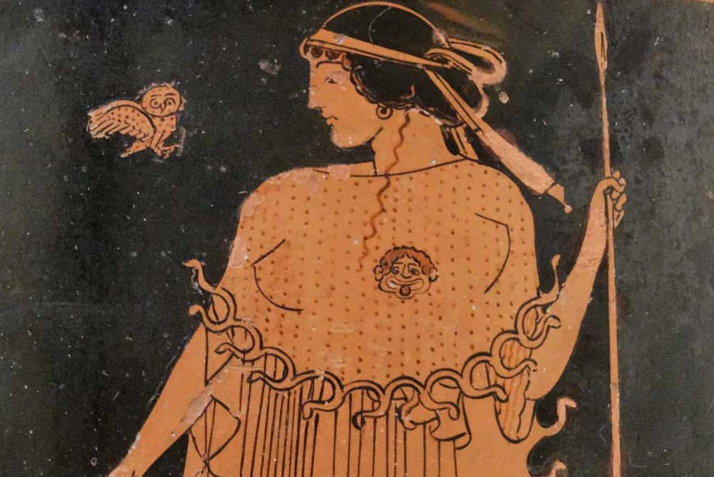
However, the relationship between the logo and our core business (supply facsimile editions of illuminated manuscripts) goes beyond a simple little owl = wisdom equation.
For millennia now, the analogy of ignorance is akin to being “in the dark” and that knowledge is illuminating has been held. This concept is the key to understanding why our users need a mascot like Athena to enlighten the way they search for fine facsimiles: her all-seeing eyes, huge and luminous, have the power to dispel confusion, always giving the exact information required.
Here is another equation: illuminate = provide all the information.
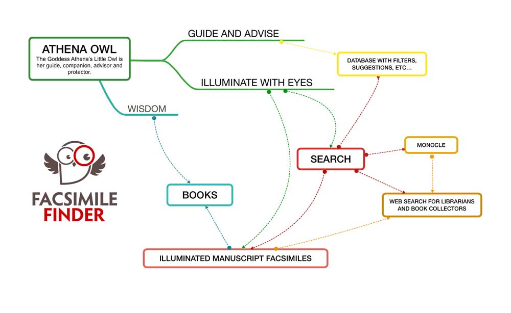
Once the image of how the owl should be represented had formed in our minds, we called the talented Elisa Paganelli to give a face to our little owl. Elisa immediately fell in love with our project and sent us a sketch that would become the first representation of our Athena:

Then the little owl hatched: here it is the first outline of the logo that would become our brand identity.

From this point on, our beloved Athena has often been on the road, traveling to fascinating places and throughout different periods of time in her quest for knowledge.


Do you love our mascot as much as we do?
If so – as we hope you do – let’s see how Athena has changed in these five years of activity.
Evolution of our logo
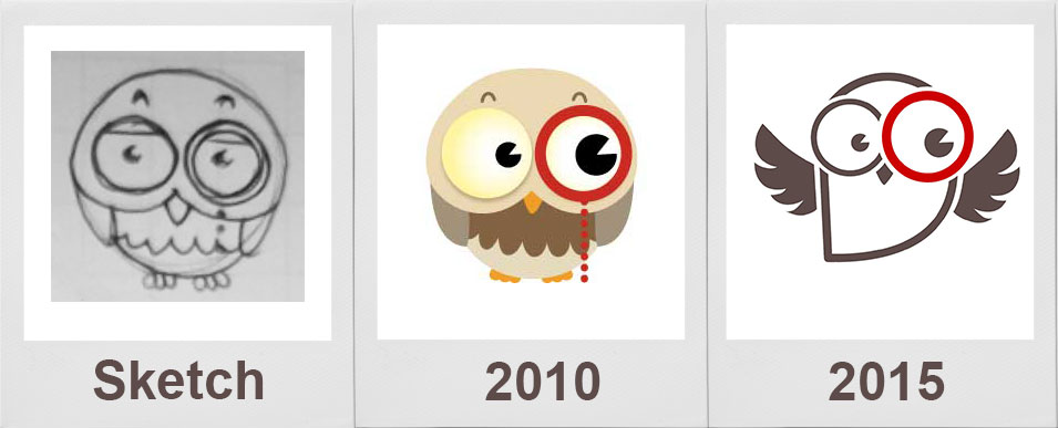
After five years of activity, it was time to reflect on our changes, as a brand and company.
We have never stopped working to improve our database, holding in check the news about web design innovation to enhance the user experience.
The 2015 trend is clean and flat, without the need for depth, shadowing, gradients, glow effects: content becomes the central part of the design and reflects the the experience for the users, that has to be smooth and easy.
This prevailing design trend of the day is perfect for our purposes, as it represents the simplicity, the brightness and the professional touch of our complete database of facsimile editions.
The new design is ideally a clean, dynamic, fresh representation of the simple and truthful aspects of our company.
Therefore, we decided to drop all the old “cartoon detail” and revert to a silhouette look.
During the process, the owl’s shape was streamlined. The feet were removed and the wings outstretched look like she was flying ever upwards… just like us!
Athena remains a core element of our brand, as she represents the wisdom of our search engine, the simplicity of our database, and the power to enlighten the world of illuminated facsimile editions.
Do you like our new look?

